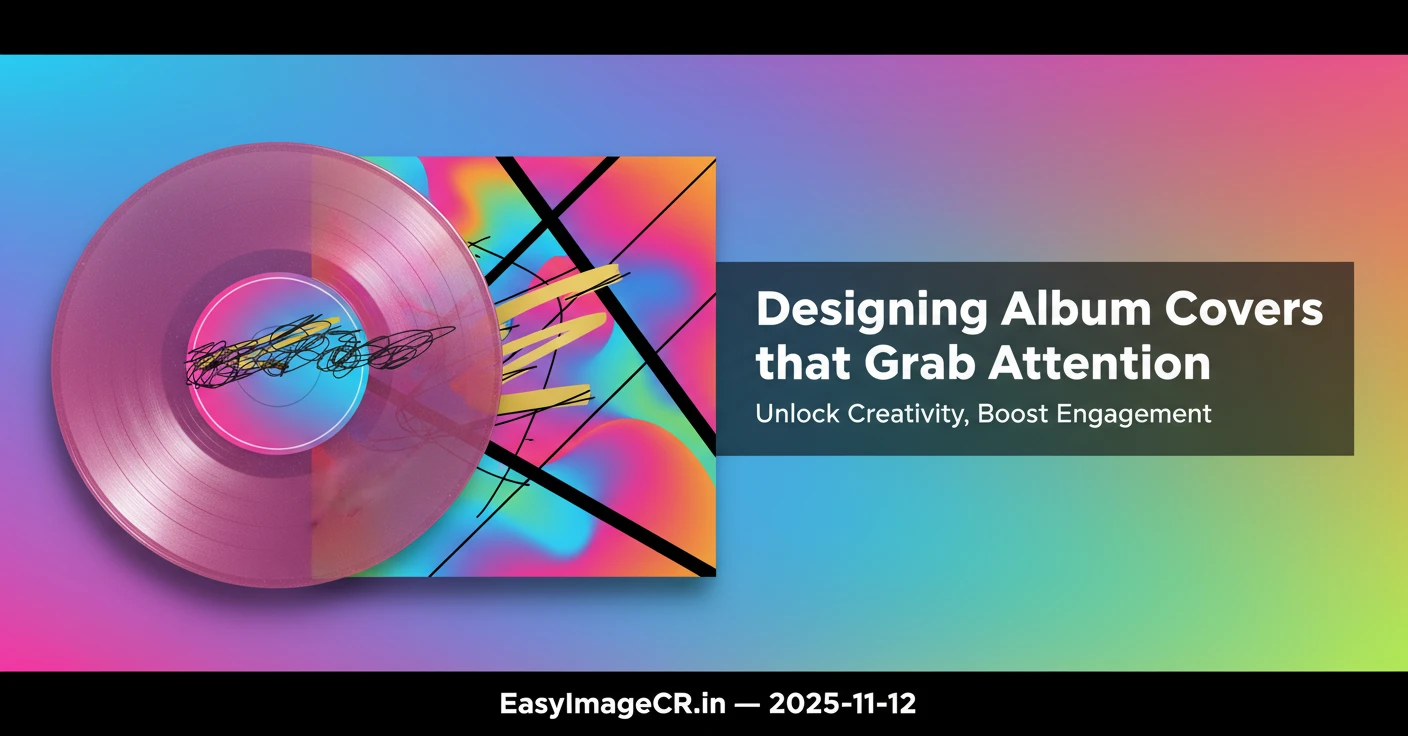
🎨 Designing Album Covers That Grab Attention in 3 Seconds
In the crowded world of streaming platforms, your album cover is the first thing people notice...
The Visual Hook: Why First Impressions Matter
Album covers have evolved from physical vinyl sleeves to tiny digital thumbnails...
In 2025, design trends have shifted toward bold simplicity...
Color: The Silent Language of Emotion
Color is one of the fastest ways to connect with an audience...
Examples:
- Indie pop: pastel or muted tones for a nostalgic vibe.
- Rap / trap: high contrast, neon lights, dark shadows, sharp edges.
- Acoustic / folk: earthy, warm hues that feel organic.
When choosing colors, keep contrast high enough to stay legible...
Simplicity Wins: The Minimalist Edge
In an era of information overload, minimalism is power...
Ask yourself:
- What is the main visual story of my cover?
- Can I remove one element and still keep the same message?
- Does the design align with my brand identity?
Minimal doesn’t mean boring — it means intentional...
Typography: Where Style Meets Clarity
Text design can make or break an album cover. The wrong font can feel out of sync with your music’s identity.

Quick rules:
- Handwritten or brush fonts feel personal and emotional.
- Clean sans-serif fonts feel modern and confident.
- Serif fonts add classic, timeless appeal.
Avoid overly decorative fonts that lose clarity when scaled down...
Composition: Guide the Eye
Every great design follows visual hierarchy...
Try using:
- Center alignment for simplicity and focus
- The rule of thirds to add energy and depth
- Negative space to make your subject stand out
Small adjustments in spacing or alignment often make the difference...
Quick Tip: Optimize for Every Platform
Once your design is ready, make sure it’s formatted correctly for each streaming service:
- Spotify: 3000×3000 px, JPG or PNG
- Apple Music: 3000×3000 px, high-resolution
- YouTube Music: up to 4000×4000 px, under 20MB
To quickly resize or convert your cover without losing quality, use EasyImageCR.in — a free browser-based resizer that processes images locally, with no uploads or watermarks.
Final Note: Art That Reflects You
A striking album cover doesn’t need expensive software...
Your cover art is more than a square image — it’s your first conversation with your listener. Make it unforgettable in three seconds.
⬅ Back to Blogs